Harbourside
Design Concept

The purpose of the Design Concept is to establish and guide the visual rhythm of the website.

This is a strategic synthesis of all the inputs: questionnaire and project direction meeting; market research and example websites; and existing brand design, imagery and content — with the website goals top of mind.

Key Goals

As discussed during our Project Direction Meeting:

  • Contrary to initial assumption, the main goal is not necessarily to sell the residential units (homes), but instead to sell the concept of cohousing; specifically Harbourside’s version of it.
  • Downplay the “waterfront property” aspect; instead shift focus to cohousing benefits and amenities.
  • Bring to the forefront the participation requirement of possible future residents; attract active and engaged people.
  • Shift target audience from senior to middle-age, young seniors, or recent retirees, to counter the impression that Harbourside is a place for assisted living.
  • Subsequent to this, offer information that helps people appropriately self-select if they would be suitable future residents.
  • Articulate and guide the process for becoming a resident in a simple, approachable way and offer means to (a) express interest (currently manual mailing list) and (b) book a tour.

Creative Direction

Colours

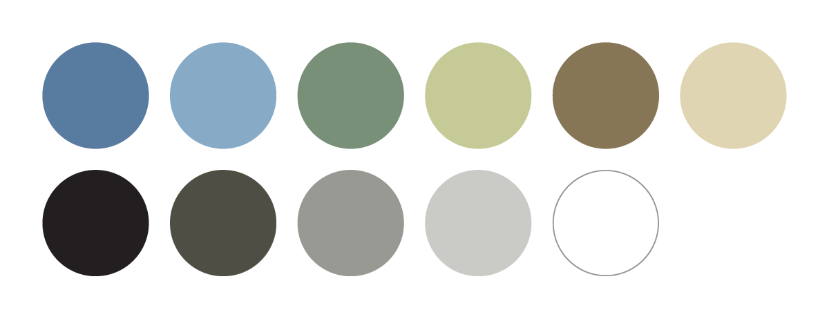
  • The website base is a minimalist, clean white background, complemented with neutrals of warm grey in dark, mid, and quarter tones.
  • Most colour will come from use of the photography.
  • Selectively used is a warm, earthy colour palette of ocean blues, forest greens, and sandstone browns; all of which reflect the physical environment of Harbourside.

Fonts

  • Consistent with the logo, the design selectively uses Philosopher for main top-level headings.
  • This is paired with Lato, a modern sans-serif font, for the navigation, subheadings, and body text. Its rounded, wide-width characters with neutral, simple forms make it easy to read and do not conflict with the title font.

Headings in Philosopher

Body text in Lato

Design Elements

  • Circular elements create cohesiveness with the circular logo and make the overall design feel modern and approachable:
  • Fully circle-ended buttons
  • Rounded corners soften website sections
  • Circular images and icons
  • Logo icon used as a watermark

Homepage Walkthrough

The homepage is a teaser menu with concise, easy-to-read summaries and Calls-to-Action (CTAs) encouraging people to explore further into the website.
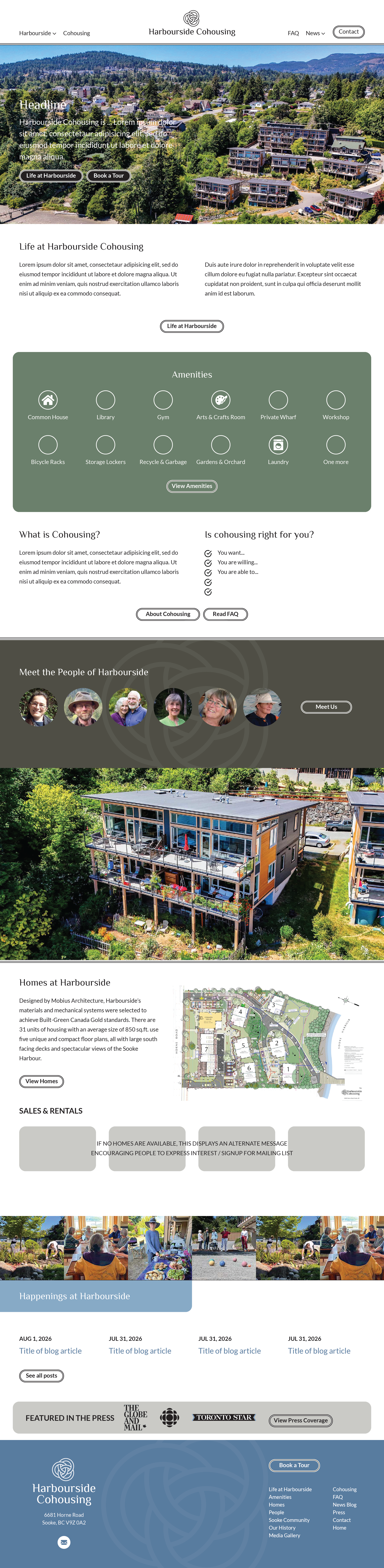
See visual Design Concept below

  • Establishes the visual brand using logo, colours, and typography.
  • Uses standard layout for easy usability; centred logo links to homepage.
  • Harbourside is a drop-down menu, under which will be the “About” section pages: Life at Harbourside, Amenities, Homes, People, Sooke Community, History, and Media Gallery.
  • News will drop-down to Blog and Press.
  • Although the ultimate CTA used throughout the website is Book Tour, the design instead highlights Contact as the CTA button here.

Also known as a Hero Section, the purpose is to clearly and simply:

  • Answer the “who, what, where, why, and how”
  • Articulate the Brand Promise
  • Provide a clear Call-to-Action (CTA)
  • Brand Promise:
    (writing in progress)
  • Main and secondary CTAs direct users to:
    (a) Life at Harbourside
    (b) Book a Tour
  • Elaborates on the brand promise and further introduces Harbourside Cohousing
  • Express the participation requirement of possible future residents to attract active and engaged people.
  • Counter the impression that Harbourside is a place for senior’s Assisted Living.
  • Presented in a spacious, easy-to-digest way
  • CTA to learn more about Life at Harbourside
  • Visual teaser highlighting the top 12 amenities
  • 12 is chosen for its ability to responsively stack in multiples of 2, 3, 4, or 6 for different screen resolutions
  • CTA to View Amenities
  • Short teaser intro to “What is Cohousing?”
  • Language that explicitly helps people self-select:
    “Is Cohousing right for you?”
  • Dual CTAs to About Cohousing and FAQ pages
  • Small visual teaser using only portraits (no names)
  • CTA to Meet Us links to People of Harbourside page
  • Brief paragraph intro about the residential buildings / construction features
  • Feature space for available Sales & Rentals
  • CTA to Learn More links to Homes page
  • News teaser section, highlighting blog and press
  • Preceded by mini photo gallery of community activities, so that the blog post teasers/excerpts do not need to always have an associated image — easier maintenance for you!
  • Blog post teasers will just list post date and title.
  • CTA to See All Posts
  • Featured in the Press
  • CTA to View Press Coverage

Standard across the entire website, the footer carries the branding through to the very end of each page.

  • Repeats the logo (other stacked variation)
  • Reiterates location
  • Includes mini sitemap

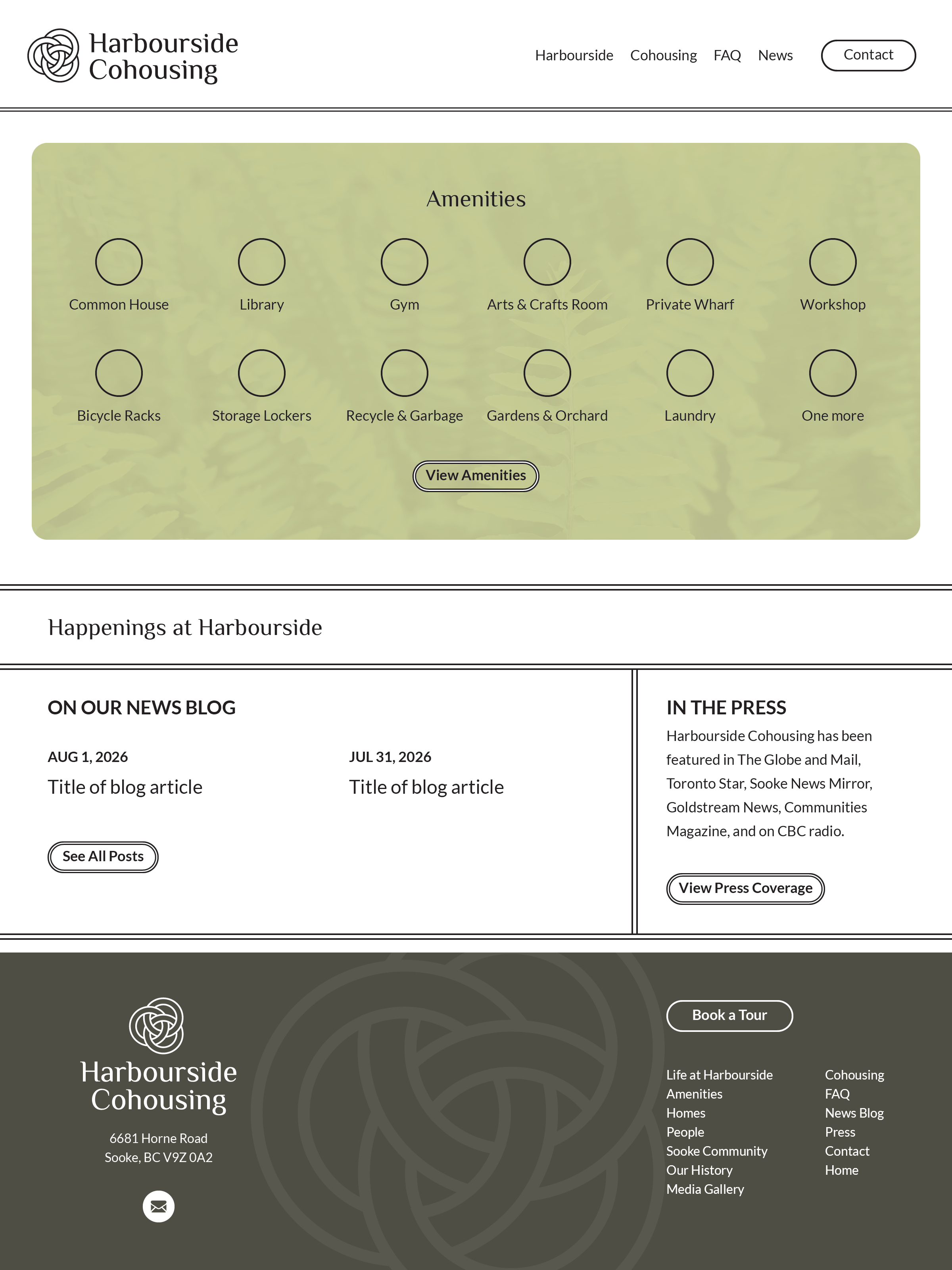
ALTERNATE DESIGN ELEMENTS:

  1. Navigation with left-aligned logo and right-aligned navigation
  2. Amenities teaser: dark icons on lighter background
  3. News (Blog + Press) teaser
  4. Footer background colour