
Portfolio:
CHQ Arcade
Brand • Website
Vancouver, BC • 2025
A playfully retro-modern brand design, mini website, and directional signage makes it game-on for a new Vancouver arcade.
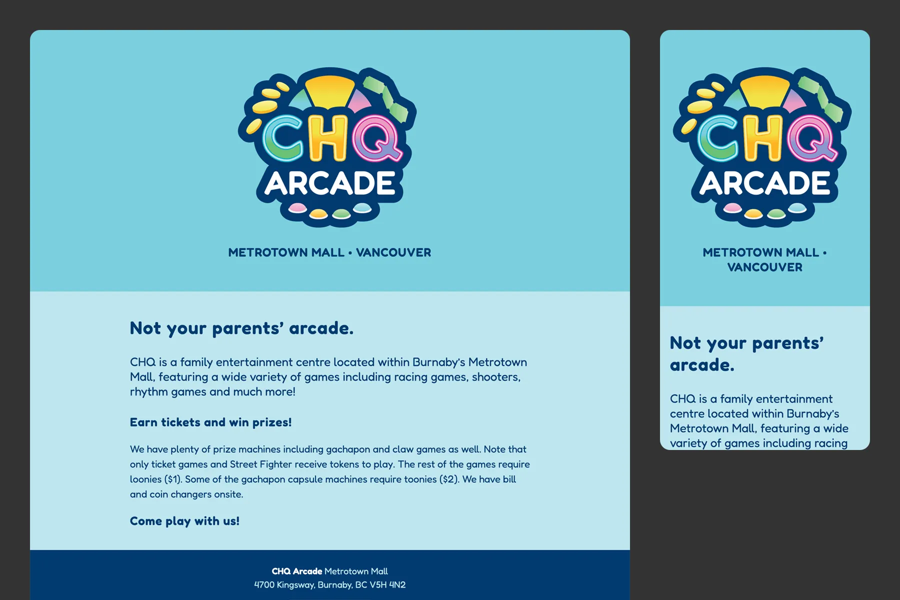
CHQ Arcade is a family entertainment centre located within Burnaby’s Metrotown Mall, featuring a wide variety of games.
We designed an 80s retro-arcade-inspired brand identity, directional signage for inside the arcade, and a mini one-page website at their own domain name that anchors the brand online and provides concise, relevant information.
Brand Design
CREATIVE BRIEF:
To design a visual brand identity that is fun, happy, friendly, approachable, adventurous and playful to attract an audience of families with younger children (preschool to early teens, ages 5-14), who are looking for affordable, high-value family entertainment.
Logo Design: Shape & Colour
Recent trends of bright candy-coloured pastels paired with rounded geometric shapes send a youthful vibe, sparking feelings of playfulness, fun and joy. Primary colours and geometric shapes are the first ones we learn as children, so are also associated with approachability. I began by sampling colours from inspo images, including the store front (light pastel neons), as well as some reboot-retro arcade imagery (brighter 90s neons coming back in style).
Thus, CHQ’s brand colours are candy-coloured pastel versions of the primary colours: Sky Blue, Sunshine Yellow, and Rose Pink, with green and other blues as supporting colours. Plus there’s amped-up electric colours as accents and calm-down light pastels as secondary/backgrounds for print collateral and the website.
COMING SOON
Stan Wong, Owner
CHQ Arcade
Services Provided
Launched: January 2025

Elevate your business or organization with a *C brand and website
*Clear *Cohesive *Creative *Collaborative *Custom *Consistent *Connected *Converting