
Portfolio:
Sabrina Lundquist Acupuncture
Brand • Website
Victoria, BC • 2026
Elevating an acupuncturist’s practice from DIY to a professional brand and WordPress website.
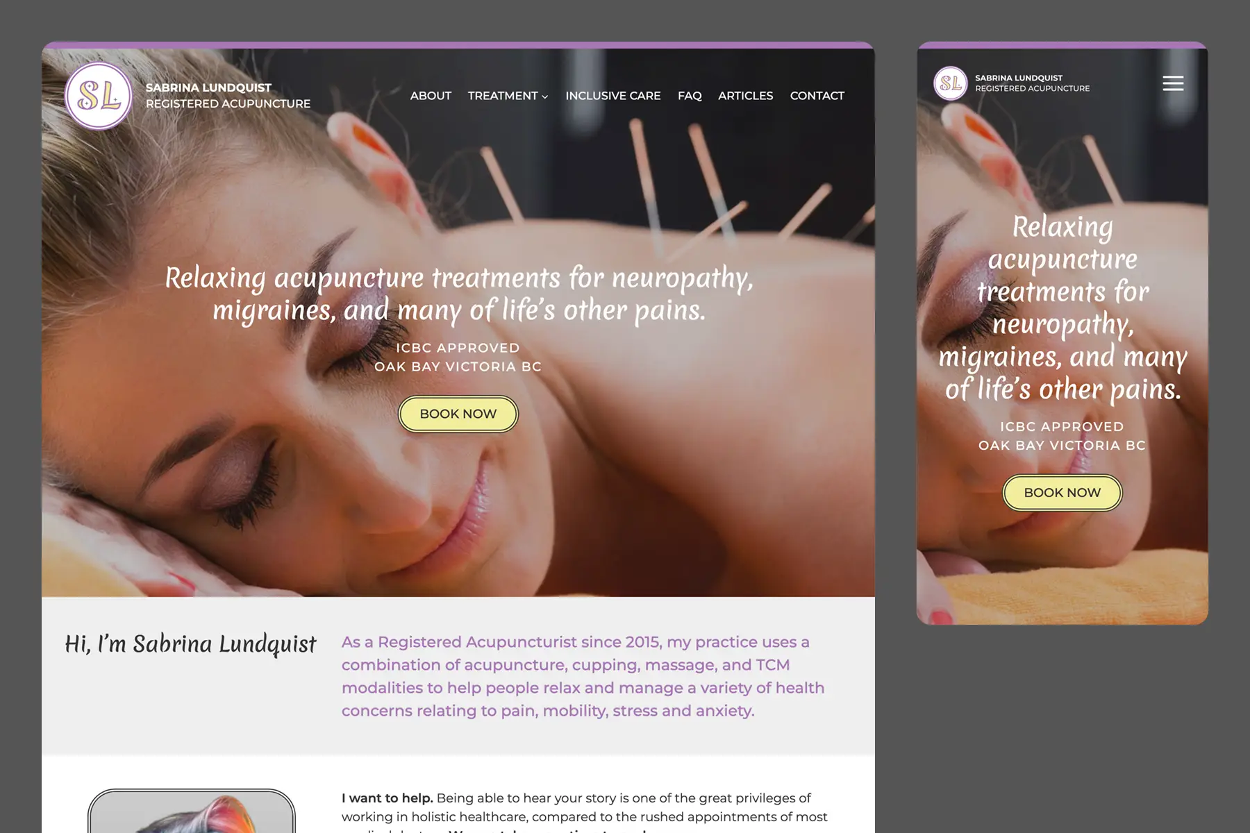
Registered Acupuncturist Sabrina Lundquist provides relaxing acupuncture, cupping and massage treatments for neuropathy, migraines, and life’s other pains in the Oak Bay neighbourhood of Victoria, BC.
Sabrina had DIY’ed her own website on Weebly, but she recognized it was time to elevate her brand and web presence to reflect her level of professionalism. We refined her brand design, including a custom logo, and built a WordPress website with improved content, SEO, and user-experience flow that leads viewers throughout the website to her primary conversion goal of booking consultation calls.
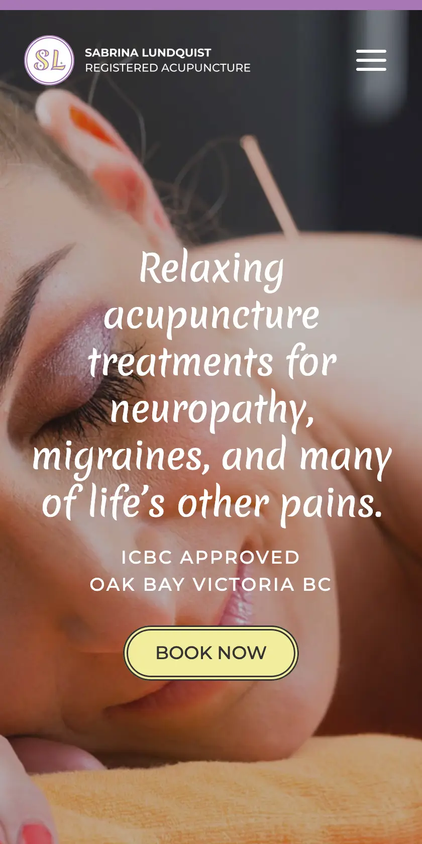
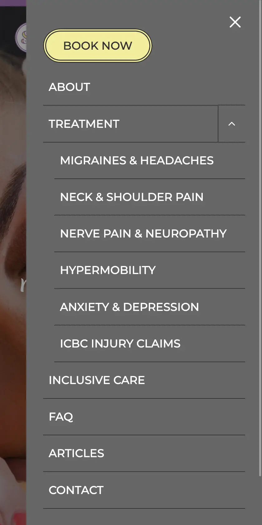
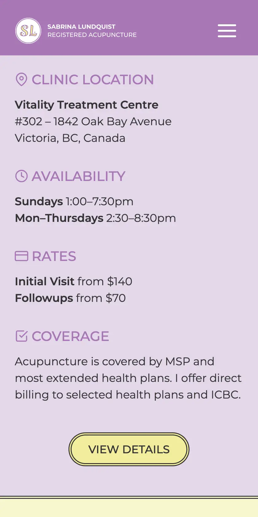
Mobile / Responsive Website Design
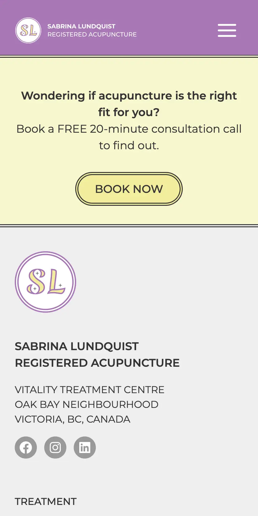
Challenge
She had setup her own website on Weebly, DIY-style.
She wanted help refining and applying her brand design and help with content layout, improving user-experience flow to lead viewers throughout the website.
She described her brand personality as low key quirky, relatable yet professional and informative and while she had some colour to her website, it was not cohesively or consistently applied throughout the website.
Her main conversion goal is to book more free consultation calls that lead to the main goal of booking more clients for in-office acupuncture treatments.
Her other challenges were search engine optimization.
Process
We began with a Website Audit, focusing on 6-core aspects: visual design, information architecture, content, SEO, functionality/usability, and conversion. I provided this in video format with accompanying checklist, which enabled Sabrina to do most of the minor edits herself, but later she booked a VIP Day for me to do the more heavy-lifting changes for her.
Brand Design
Typography
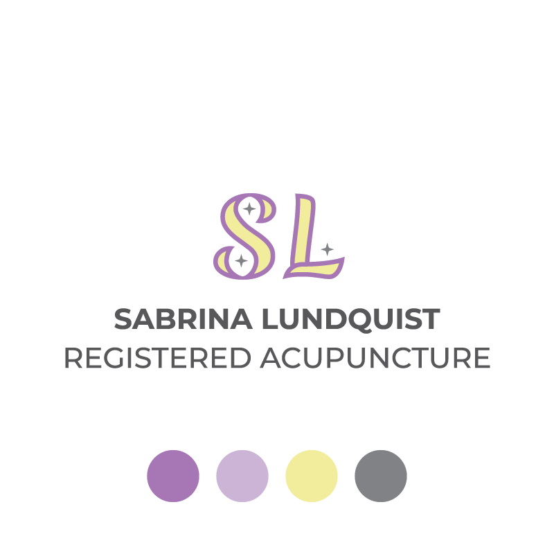
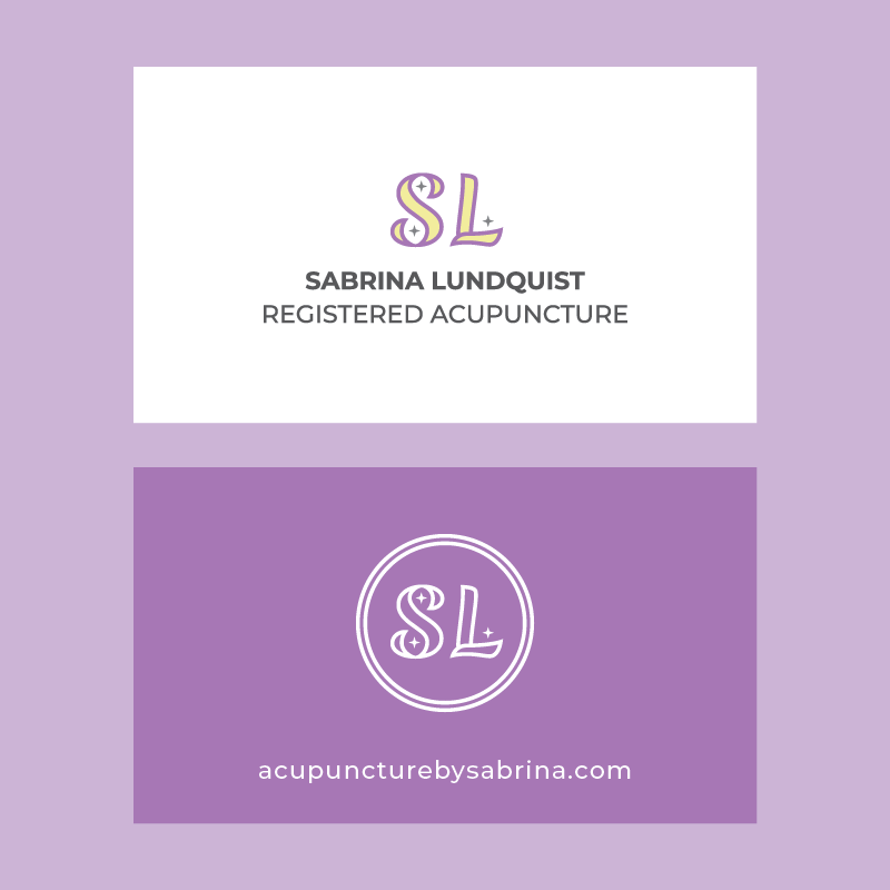
Merienda was chosen for its brushstroke-like script, evoking the east-meets-west values that form part of Sabrina’s modern acupuncture practice. This was customized into a duo-outline, with added pin-prick stars. This double-outline became a brand element used throughout the website, on buttons and circular image borders.
Colours
We refined and expanded Sabrina’s chosen colour palette with shades of purple in Eggplant, Lavender, and Lilac.
The mysticism of purple, paired with warm and cool tones of butter yellow and steel grey create a balance of quirky, yet calming.
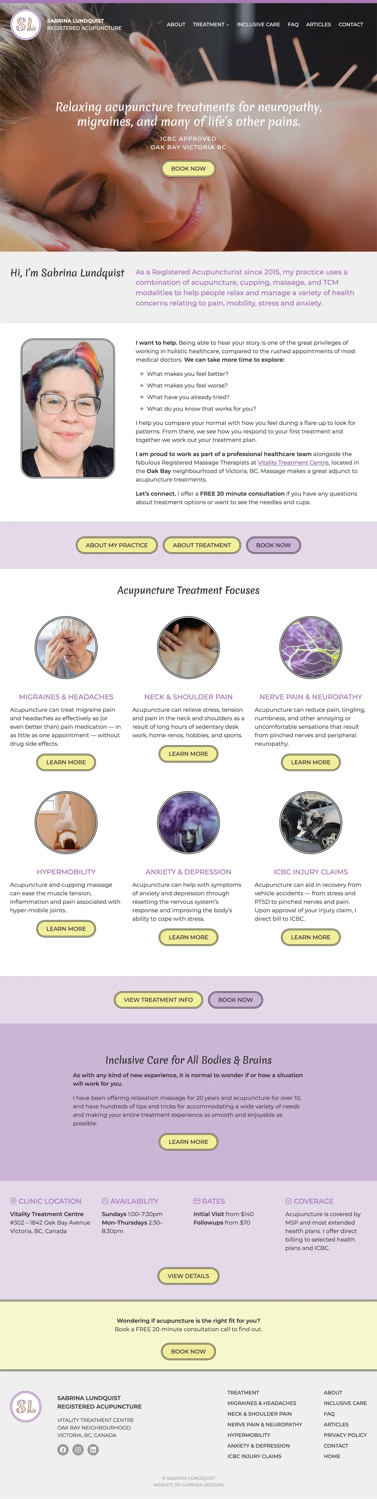
The homepage serves as a teaser menu into the various areas of the website, appropriately punctuated with Book Now CTAs:
Intro & About Practice
About Treatment
Treatment Focuses
Inclusive Care
Clinic & Practice Details
Established with the homepage, this visual rhythm is continued through the website; however, each page is thoughtfully, uniquely designed around its content. The result is a cohesive whole, with consistent branding carried throughout.
Services Provided
Photography Credits: Stock
Client Since: Summer 2025
Website Launched: January 2026

Ready to elevate your business with a *C brand and website?
*Clear *Cohesive *Consistent *Creative *Collaborative *Custom *Converting